.jpg)
Hesitating with the cloud transition comes with a high price tag

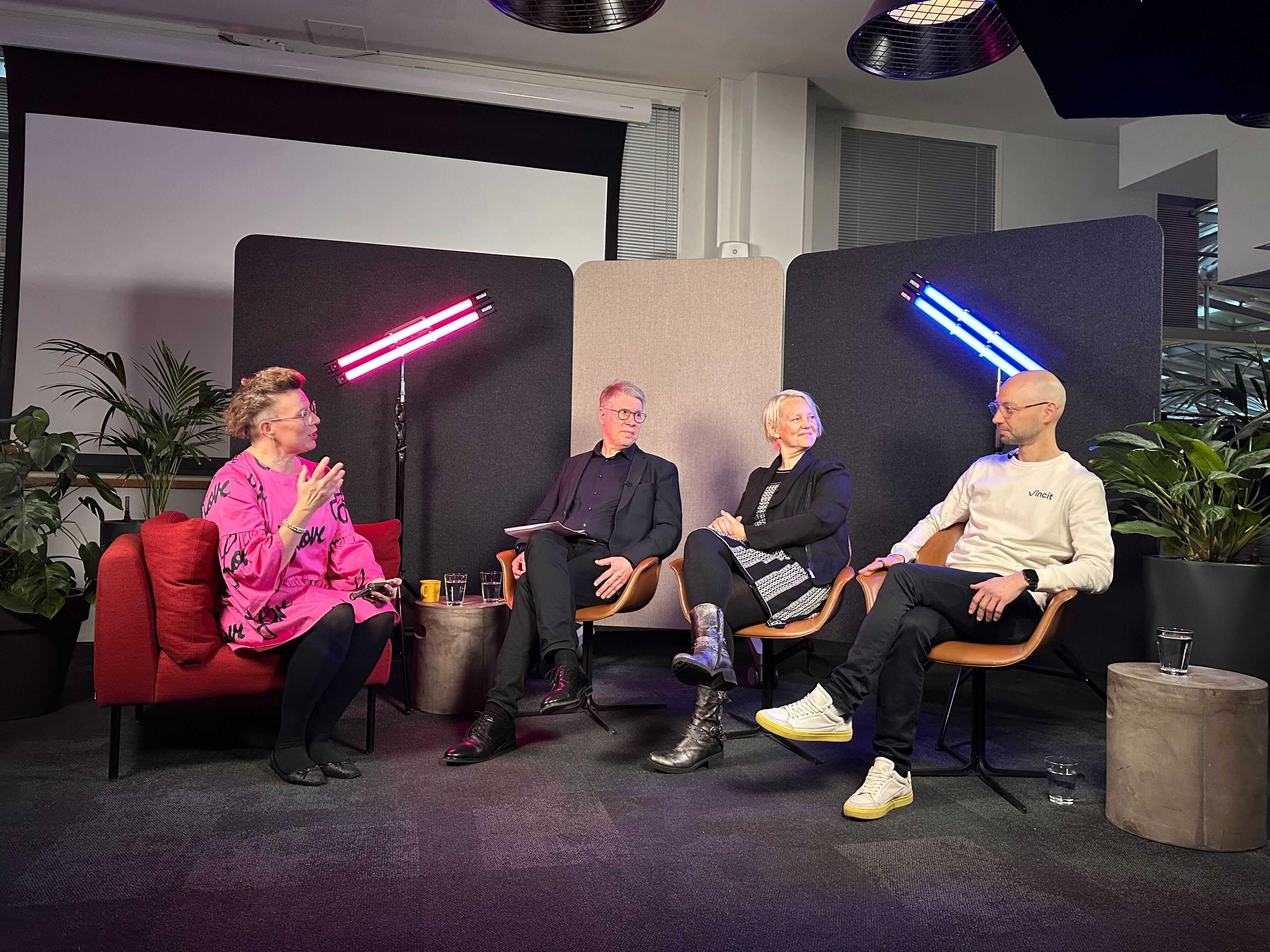
Building with agents: How to scale AI development without losing control

Our promise to each other: Why we built a "street smart" code of conduct

How the right architecture is the key to enabling agentic commerce in B2B

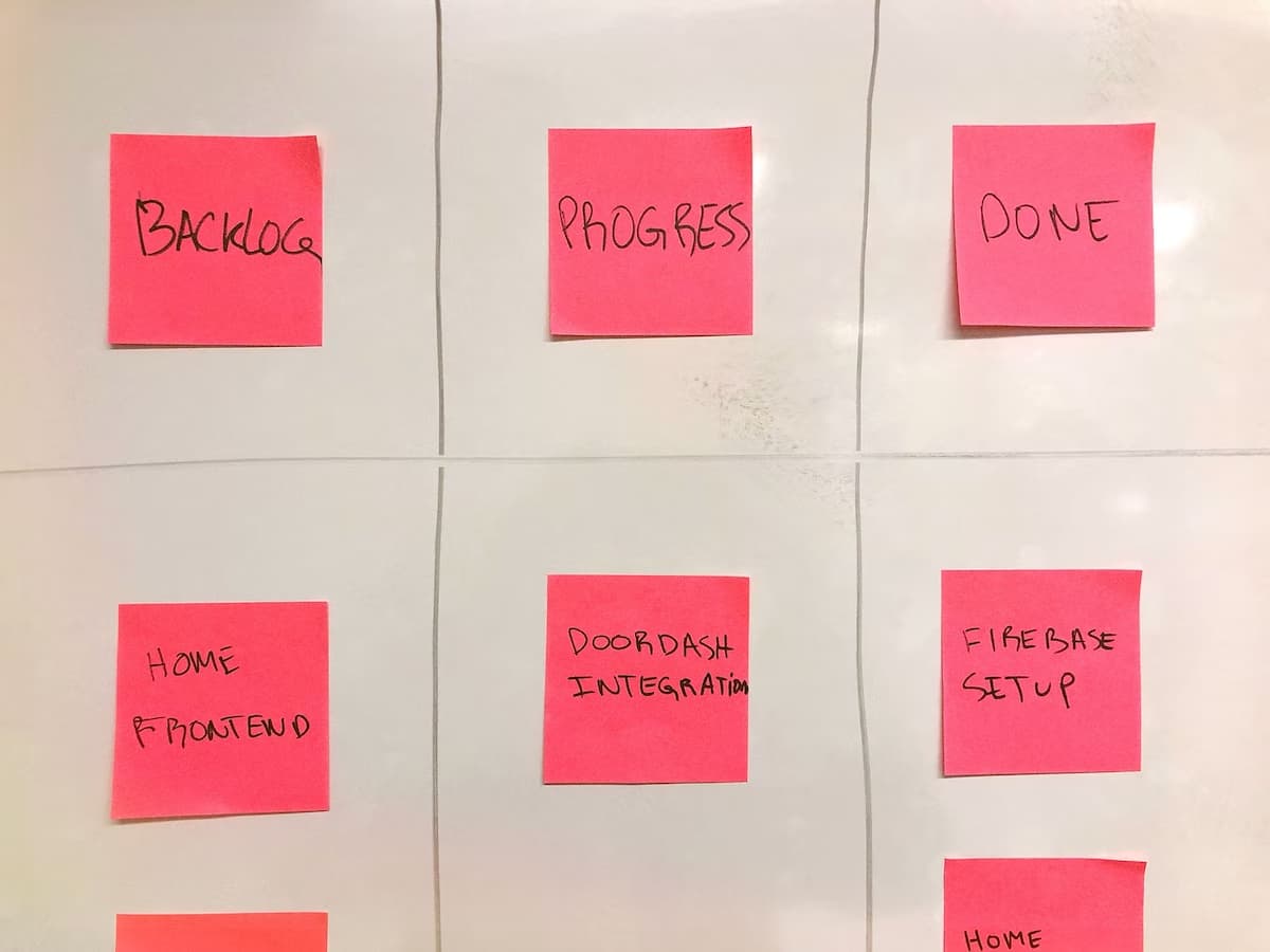
Over a year of agentic software development: what changed and what didn't
.jpg)
Five practical initiatives to support agentic AI skills at Vincit

Beyond the chatbot: how to boost retail ROI with agentic AI

The hidden cost of speed: when the bill for AI debt comes due

What agentic AI in commerce looks like in practice – a concrete use case

How AI agents are changing the way we build digital solutions

Why agentic AI in commerce is a big opportunity for B2B sellers

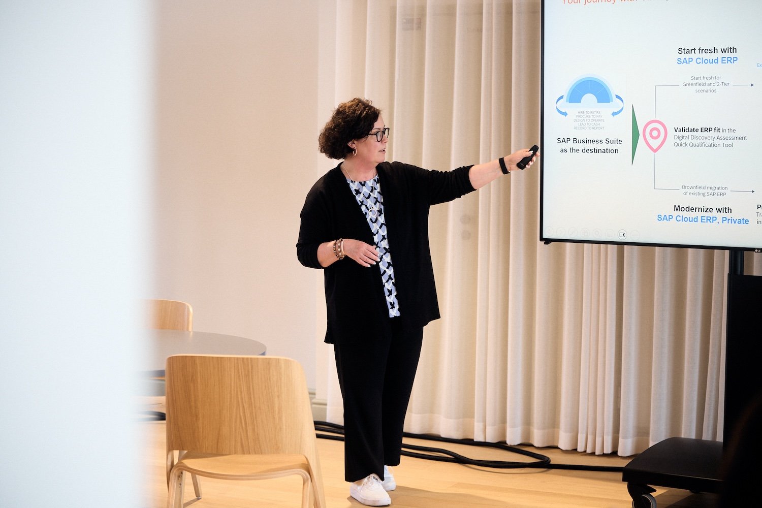
3 ways that SAP BTP can help your organization succeed

How Nordic manufacturers are using AI to create better business outcomes
.jpg)
Our candidate-friendly recruitment process at Vincit
5 key takeaways from the Grow with Vincit customer event

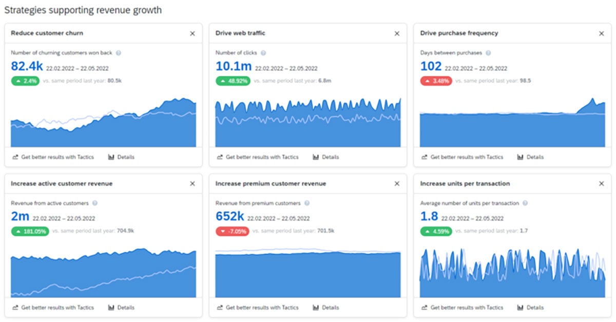
Improving the operational efficiency of your ecommerce setup

“Would you like to call a human to chat?” – what can GenAI software actually bring to customer service?
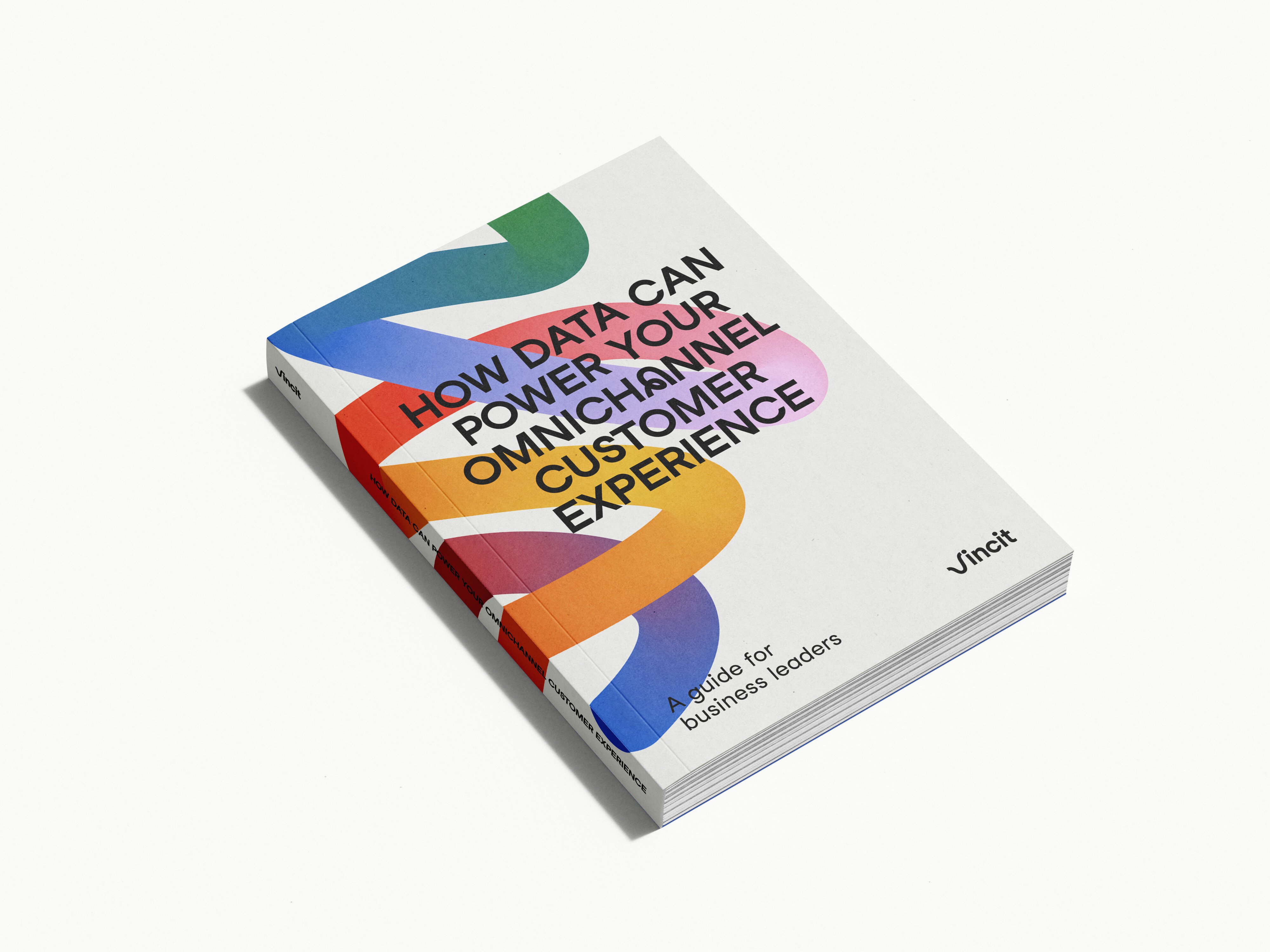
Guide: How data can power your omnichannel customer experience

Practical tips to proactively manage the accessibility debt

Five B2B ecommerce trends that your company can take advantage of

The 4 business issues that drive the need for B2B commerce investments

Better Mondays

The first steps to being a better ally in the workplace

Whitepaper: Make your eCommerce recession resilient by going headless
Creating the best place to grow – Univincity 2.0

Picking the best service model to keep your solutions running smoothly

Mind the gap – how we get from business vision to a functional and concrete enterprise architecture

The power of customer data – your organization’s most crucial asset
.jpg)
The three kinds of tools for creating useful SAP apps

What does humane leadership mean in practice at Vincit?

How do we design sustainable business operations for the future with AI?

Enable your business growth with SAP S/4HANA Cloud and Vincit

Why simplifying business apps is key to a good user experience?

Three Strategic Digital Innovation Initiatives Every Manufacturer Needs

Easily produce SAP apps your business and users will love

Why a digital strategy is a crucial guide for your business

How to help ensure a successful AI project - 3 tips for business leaders

Accessibility is not accessible. A call to action

What’s the best technology to use if you want to create a mobile app?

Using, Not Building

Extraordinary things are created together – what we mean by Vincit’s new value
Complexity, simplified

Leadership in a Time of Unprecedented Change

5 Ways to Keep Employees Motivated

Promoting a culture where everyone feels welcome and appreciated as themselves

Prepare not Panic: Managing Anxiety During a Difficult Time

The Future of the Workplace: How to Thrive not just Survive

Strengthening Company Culture in 2021 & Beyond

Transforming Legal Practices with Generative AI

Go the extra accessibility mile– detect commonly undetected issues
How to make sure your move into B2B digital commerce is a success

AI governance – 5 important things to know about the EU AI Act
How to start taking advantage of generative AI now – watch the webinar!

Navigating Recruitment's AI revolution

Making medicine smarter – 5 ways AI will impact healthcare professions

6 important things to keep in mind when using generative AI

The three key ways how digital supply chains lead to customer excellence

Streamlining product development - 8 ways that AI will make an impact

Reimagining the ecommerce Industry: Unveiling digital transformation strategies
.jpg)
Better efficiency, empathy, and quality – 8 ways that AI will change customer service

Helping CDOs – 7 ways generative AI will speed up digital development

Guide to E-Commerce App Development: Steps, Key Features and Trends

Streamlining HR – 9 ways generative AI will impact talent acquisition

5 common mistakes to avoid when making a digital business transformation

Updating IT support – 7 ways that generative AI will make a big difference
“New” marketing platform from SAP – what’s interesting in Emarsys?

Customer Engagement vs. Customer Experience in E-Commerce

User Experience vs. Customer Experience: Key Differences

Here’s 7 easy ways you can start using generative AI at work now

Cracking the Code of MVP Design: Prioritize UX

Styling a Superior User Experience on Your App

Making marketing more effective – 6 ways how generative AI will make an impact

Leveraging AI to Optimize Your E-Commerce Store

5 ways that generative AI will change legal work

How to Reduce the Dangers of Broken Authentication on Your App

7 practical ways that AI will impact continuous software development

7 reasons why now is the time to pursue digital business transformation

Configuring Your App's User Roles for Safety and Success

Nine ways that generative AI will power sales processes in the future

Blog: New to Generative AI? 5 things to do now as a business leader

Blog: Guide to Creating an E-commerce Customer Experience (CX)

Blog: All sales have become digital – are you ready to take advantage?

Blog: How SAP Analytics Cloud will take your planning to the next level
.png)
Blog: What is Digital Product Development? Steps to Success

Blog: Guard Your Users Against a Data Breach with Best Practices for AWS S3 Storage

Blog: Accelerate your digital transformation by outsourcing software development
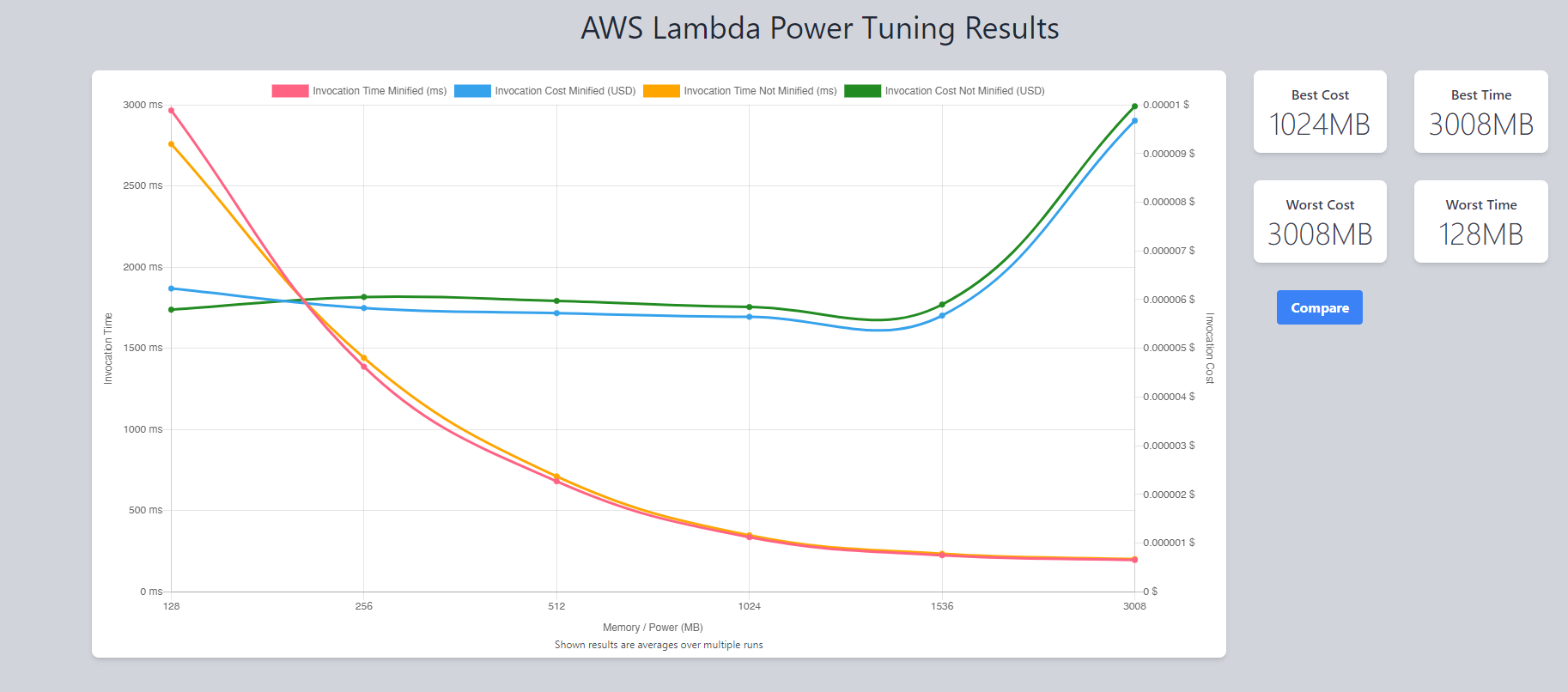
Blog: Optimize Your AWS Lambda Functions for Cost and Performance

Blog: Implementing accessibility in a large project – the EVOYA Platform from Revvity

Blog: Five key takeaways from the SAP Build Hackathon 2023

How Digital Transformation is Enhancing Customer Experience
-1.png)
Blog: How we use generative AI at Vincit

More Radio, Less Static: Building Dynamic Digital Radio Apps

Magento V. 1 EOL and Why It Pays to Build With Composable Software

Blog: Will you get in legal trouble for using GitHub Copilot for work?

Blog: Using ChatGPT for programming

Delight your Customers During a Recession
Blog: How to Build an Ecommerce Website Step by Step

Blog: How to design the perfect system

Blog: Four ways to reduce the carbon footprint of digital solutions

Blog: Take the lead in your industry with modern business technology

Blog: Four ways to check if your commerce architecture is future-proof

Blog: SAP can help enable digital transformation
Blog: The IBU app wins a Red Dot!

Blog: Lower the Bar – Starting With Web Accessibility

Blog: Ready To Disrupt the Market by Building Your Own Marketplace?

Blog: The maintenance of a digital service begins during the design phase – take these three things into account

Blog: The key elements of sustainable partnership – Vincit x Reactron Technologies

Blog: Build true customer value through an e-commerce ecosystem

Blog: Despite Common Concerns, Headless eCommerce May Be the Easier and More Effective Option

Blog: Medical segment software development in turbulence

Blog: Digital sales in ecosystems – 3 steps to get you started

Blog: Getting the most out of data-driven digital sales

Blog: Count me in – Web accessibility impacts all of us

Blog: Summer 2020 Update

The Ultimate Guide to Headless Commerce - The Future For Digital Sales

Blog: Building tangible competitive advantage in digital sales through sustainability

Blog: New tricks for a new decade?

Blog: Successful business development looks to potential futures

Blog: Reducing carbon footprint in digital services – Case IBU

Blog: What will accessibility look like in 2022-2025?

Blog: Total digitalization of sales – how to emerge as a winner?
Blog: Choosing a Mobile Technology in 2022

Blog: What is UX Strategy? And How Can You Create and Transform the Customer Journey?

Blog: Leadership Principles for Tomorrow

Blog: What is Headless Commerce? And Everything You Need to Know About Building a Headless Commerce Strategy
Blog: 5 Foundations to Building A Solid UX Strategy for your Brand

Blog: Improving Online Customer Experiences Through Modern Technologies

Blog: Try a study group to improve your digital accessibility

Blog: 5 reasons successful digital initiatives always consider the human aspect

Blog: How to boost design thinking part 3 – Design critique

Blog: How to boost design thinking part 2: Design communication

Blog: How to boost design thinking part 1– Design, mentoring and creative thinking

Blog: Efficiency and customer-centeredness through a digital supply chain

Blog: How to Use RxSwift with MVVM Pattern (A Complete Guide)

Blog: Digital transformation isn’t about technology but people

Blog: 8+1 tips – how can a development team help their product owner succeed?

Blog: Vincit has been awarded ISO 13485 medical certification

Blog: Riding the Wave – How Sixthreezero’s Investment in Digital Experience Drives Growth

Blog: Circular economy sparks new business – where to start?

Blog: How I got a campsite from a fully booked Grand Canyon campground

Blog: Are You Prepared for Digital-First Home Buyers and Renters?

Blog: Shopify Plus vs. Magento 2 Commerce: Which Platform is Best For You?

Blog: Shopify vs Shopify Plus | The 9 Key Differences Between the 2 Platforms

Blog: How to start developing information security management in a human-centered way?

Blog: How Smiles Kept Our Office Safe

Blog: Technology Spotlight: Chakra UI

Blog: How to properly build a cloud service
Blog: Driving Dealership Revenue Through Digital Marketing Transformation

Blog: Human-centered information security management

Blog: 5 ways in which accessibility will improve your business

Blog: Digital eXperience Platforms – the make of a modern digital customer experience

Blog: Mobile App Maintenance – How to Keep Users Happy

Blog: Agile and design – together at last

Blog: Driving Customer Experience with VR/AR Technology

Blog: Top ten questions from digital design

Blog: Healthcare Mobile Application Development Cycle

Blog: Designing and Developing Digital Accessibility

Blog: Designing health and welfare apps is a precise business

Blog: What Makes Healthcare Application Development So Complicated?

Blog: What Is the Cost of Shopify Plus and Fees?
%20is%20about%20people.jpg)
Blog: My eCommerce Adventure: a Fireside Chat with SixThreeZero CEO

Blog: What is Shopify Plus?

Blog: Why Must a Healthcare App be HIPAA Compliant?
Blog: Generating Code From Your GraphQL Schemas

Blog: Career Hunting in Tech

Blog: Utilizing PubNub for Real Time Member Communication

Blog: Three things to consider when acquiring data services

Blog: Four ways to enable mobile payments in apps

Blog: What Are the Top Health App Trends of 2020?

Blog: When should you use React Native?
Blog: How to Design & Develop a Mobile Health Application
Blog: 10 Essential Integrations for Your Ecommerce Website

Blog: A Mobile App Marketing Checklist

How to Implement Artificial Intelligence (AI) in JavaScript?

Blog: Data analytics, artificial intelligence, and machine learning – buzz words simplified
Blog: Fix Custom Font Inconsistency in React Native

Blog: Balancing All User Requirements During Healthcare Application Development

Blog: Should you update your ecommerce amid a culture shock?

Blog: Considerations for Mobile Health App Development

Blog: How to organize a one-hour retrospective for 30 people?

Blog: How to Start Remote Work at Your Company

Blog: How to tell if your Application Needs an Overhaul or Small Upgrade
Blog: Why you should consider accessibility in your development

Blog: Kelley Blue Book's Journey to Microservices

Blog: Getting Started with AWS DevOps using AWS Amplify
Blog: The World (Wide Web) is Mobile, Are You?

Blog: What a Successful Software Development Relationship Looks Like

Blog: How to Select Your Software Development Agency

Blog: Duck Tapes Transcript: Rematch and Dimension 7

Blog: Trying out SwiftUI

Blog: Experimenting with Style Transfer using PyTorch

Blog: Duck Tapes Transcript: Native Modules and Blockchain with Adem Bilican
Blog: Introduction to Kubernetes: Part 2

Blog: The Dawn of Planet Centric Design

Blog: Introduction to Kubernetes: Part 1

Duck Tapes Transcript: Code School life with Alex Aranda

Blog: Agile Development in a Nutshell
Blog: Duck Tapes Transcript: James Snell's NodeJS OC Talk
.avif)
Blog: Is the Tesla Cybertruck ugly or beautiful?

Blog: Duck Tapes Transcript: React Native with Gant Laborde

Things you didn't know about Fibonacci

Blog: Why and How to Outsource Software Development

Blog: Designing for an age of transition

Blog: Mobile app benefits for business – Do we need an app just because our competitors got one?
OAuth 2.0 and OIDC: what should I know about tokens?
Blog: Five reasons to utilize analytics in your business

Blog: Rachel Valentine Mix!
Blog: Six reasons why you want to code your cloud environment

Blog: Jonny Burger Mix!

Blog: Laurence Bradford Mix!

Blog: William Candillon Mix! - React Native

Blog: The New Features in React DevTools 4

Blog: Shawn Wang Mix! (aka SWYX)
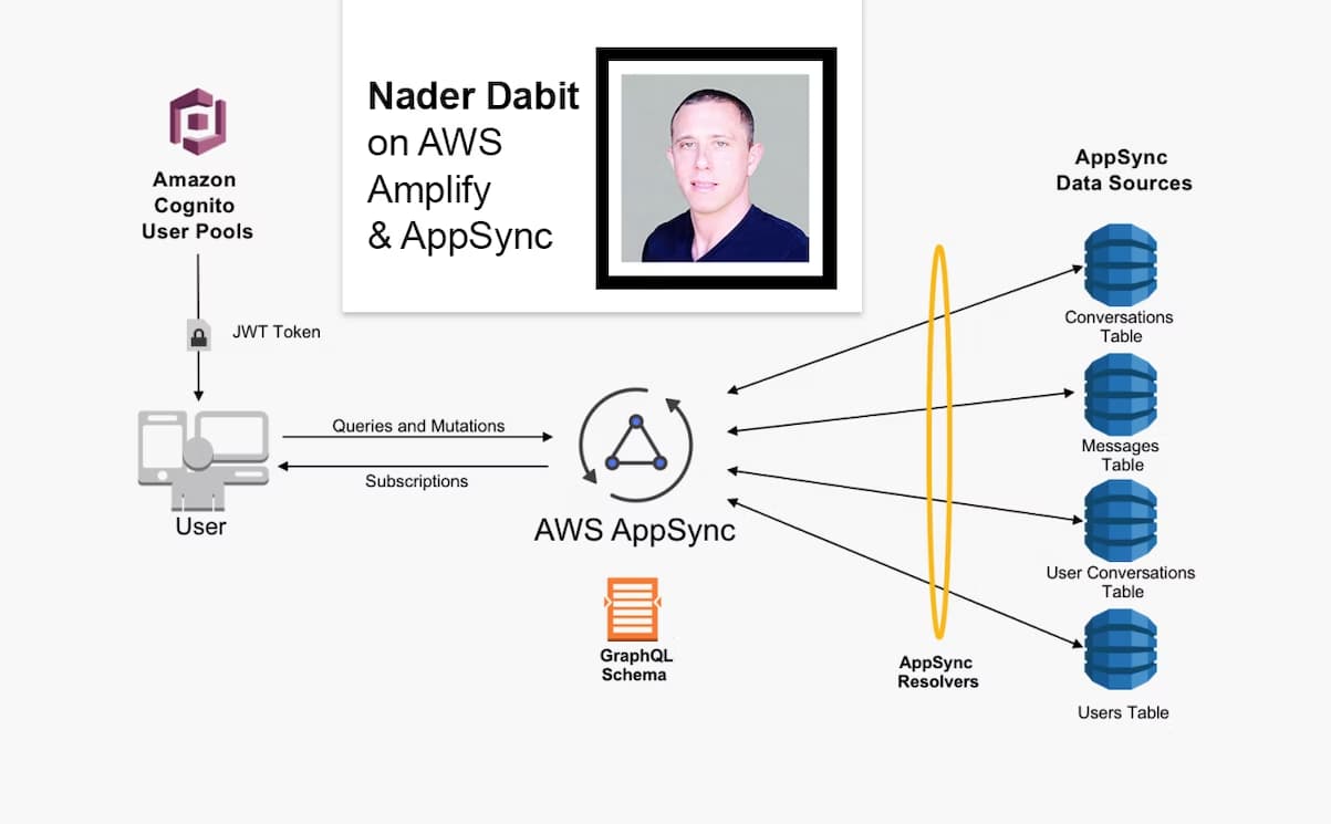
Blog: Nader Dabit Mix!

Blog: The John and Tiffany Mix!

Blog: Eemeli's Open Source Mix!

Blog: React Native Mix Vol.1!

What is User Experience (UX) and Why is it Important?

Blog: Kent C. Dodds Mix!

Blog: Wes Bos Mix!

Blog: A different kind of UX team

The C-Life Podcast - Ville Houttu

Blog: Getting Started With Storybook 5.0 for React

Blog: An Introduction to React Hooks

Blog: Overview of Mobile Development Frameworks in 2019 | Native, React Native, Flutter and Others

Blog: Kickstart your GraphQL API with Hasura