Color Theming
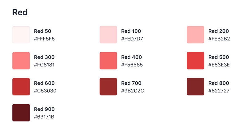
I’ve absolutely loved the way chakra encourages color themes. By creating a color palette of 10 shades around a color, Chakra components can automatically create states for hover, active, disabled, etc.
 After you’ve defined your color palette, by passing the variantColor prop to supported components, you’re all set!
<Button variantColor="green">Button</Button>
Simplifying Inline Styling with Style Props
Chakra UI uses Styled System to offer a way to alter the style of a component by passing props to it. This also provides shorthand versions of common props, like margin as “m” and padding as “p”. Drawing from the constraint based design system, it's possible to pass an array of variables so your theme-defined breakpoints can determine which value to use. If you’re curious about how this works, check out this page. Great typescript integration also allows for tab completion of certain style props. For small differences between components, inline styling is such a breeze:
<Text {...bodyMedium} textTransform="uppercase" fontWeight={400} m=”4px”>
Hello there!
</Text>
Coming from a Styled Components approach where all your styled divs, buttons, etc for a single file are defined at the top, this took some getting used to. But I quickly realized how much easier it is for me to change styles without needing to context switch to a different part of the file, and also to figure out when I needed to refactor something into a base component. When the component begins to grow in style complexity, and thus code length, naturally you’ll want to move it to its own file. Which leads me to my next point…
Ease of Composability
Since the library is built on typescript, not only are the components typed, but the prop types are exported as well. This makes it very simple and easy to do something like this:
export interface CommonButtonProps extends ButtonProps { buttonStyle?: 'large' | 'small' | 'strong'; }
This gives you the great flexibility of being able to use your base components, in my case large, small, or strong buttons, while still being able to pass along Chakra button props without hassle.
Large Selection of Pre-built Components
Rather than having to port your pre-built code from other projects for things like modals and drawers, nearly everything you need is pre-built and accessible, you need only to style it if you want. I gotta hand it to the Chakra team, they did a great job making the component re-styling pretty hassle free.
Emotion styling when needed
When you do need to get a bit more specific, you can do the following:
Import jsx from emotion, css and useTheme from Chakra
/** @jsx jsx*/ // @ts-ignore (needed since typescript complains jsx is not used) import { jsx } from '@emotion/core';
Inside your component, create your specific styles.
const theme = useTheme(); const styles = css({ '&:hover': { path: { fill: 'white', }, }, '&[data-active]': { path: { fill: 'white', }, }, })(theme);
Then, in your component, attach the styles variable to the css prop:
<Button {...props} css={styles}/>
In my case, I had to do some specific styling to child path components of an svg, since the is Active boolean property added the data-active property, and doesn't trigger the native browser active event.
Conclusion
After the slight adjustment coming from “styled components”, I think Chakra UI is going to be my preferred method for component implementation in the future. That’s not to say “styled components” is bad, just that the ease of use and general paradigm that Chakra presents is more appealing to me. Looking forward to the release of version 1.0!


