In the previous parts of this series we’ve built a versatile button component from the ground up that adapts to every need of the end-user and the designer alike. In this final part we add icons to to the mix and end up smashing headfirst into some philosophical questions about the role of components in a design system.
 Fig. 1. Remember when this was all we had? Simpler times...
Icons
Sometimes it’s useful to have the button text accompanied—or replaced—by an icon. There are many reasons to do so, here are some:
-
Add flavor or color to a UI to make it visually more interesting.
-
Save space by replacing a text with an icon.
-
Make certain actions more understandable by accompanying the button text with an icon.
-
Make certain actions more prominent by emphasizing them with an icon
-
Reinforce the meaning of an icon by repeated use, to make the user familiar with it.
 Fig. 2. Using icons to replace words can save space. But what about readability?
As we learned in the last blog, clear usage guidelines are essential to any addition to the design system. In Fig. 2 we have three different ways to represent the same action. Having new options brings a new source of potential inconsistencies in the UI. To avoid these problems, we need to define:
-
Clear usage guidelines on when to use icons and when not to.
- Placement: leading, trailing, or either side of the text? Both sides in the same button? Usage guidelines on which side to pick in which situation.
-
Guidelines for picking the right combination of text and icon for a given situation.
These decisions and guidelines are a whole new can of worms that we’ll skip over. The point is that these are things that should be considered. And the issue isn’t limited to just icons—we could have a short content guideline on writing good button texts as well, it’s just that icons complicate these matters even further.
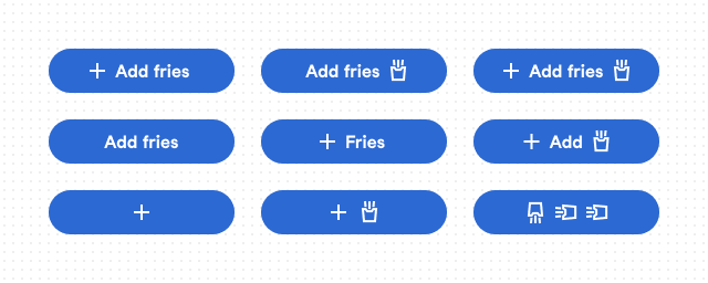 Fig. 3. It’s a D&D alignment chart (look it up). Bottom right corner spells “A D D”.
The case of an icon button
In the Fig. 3 above, the button at the bottom left corner has a single icon and no text. That’s a common use case and it actually warrants some extra care in terms of sizing. Let’s add a variant, see the comparison in Fig. 4 below.
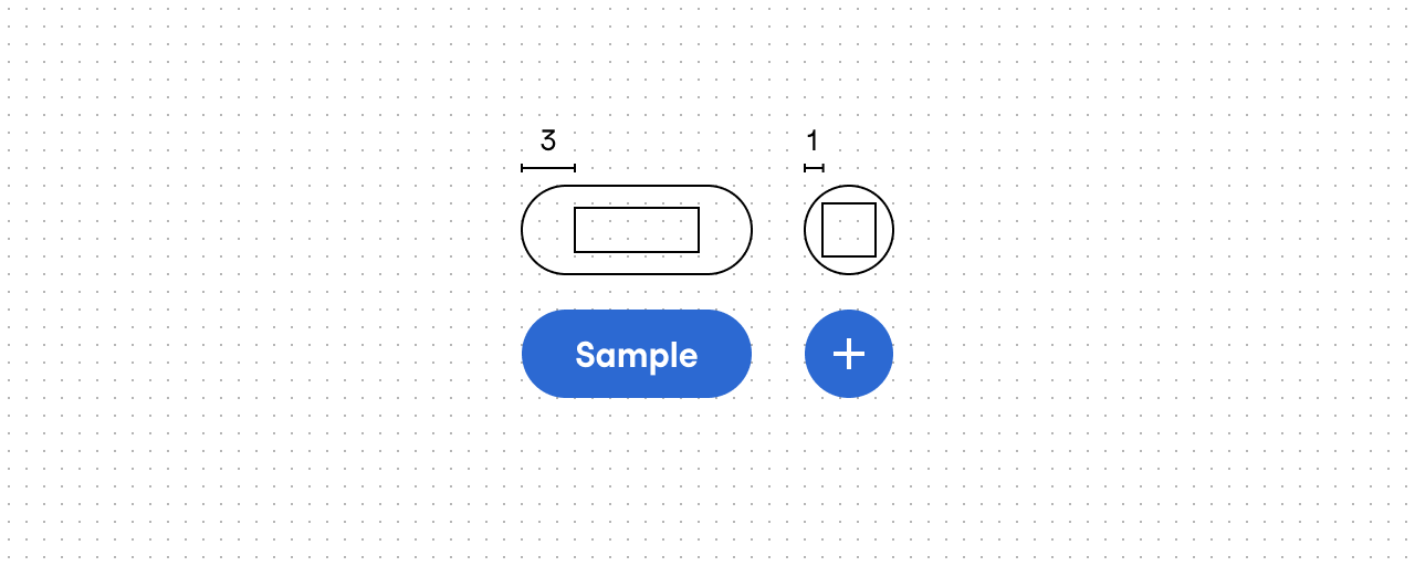
Fig. 4. With a bit of adjustment to the side paddings, we get a perfectly round button.
Our button is coming along nicely, right? Now, let’s bring back the modal window example from the last blog post. (Fig. 5) Notice anything of interest in the there—other than the fact that we have finally settled on a pair of button styles. Well, the thing that I’m talking about is that little X icon in the upper right corner that closes the window.
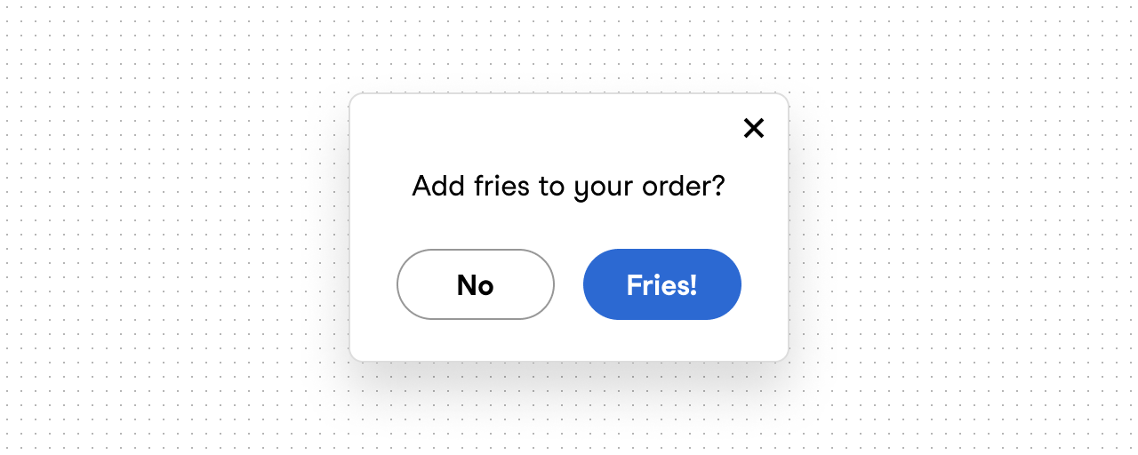
Fig. 5. There are three buttons here and one of them is not like the others.
In case you didn’t know, that little X is also a button. Let’s shift through our style variants to find the one with with the following properties:
-
black icon
-
white background
-
no outline.
There’s a style variant matching those exact requirements and it’s called inverse primary (marked with an arrow in Fig. 6).
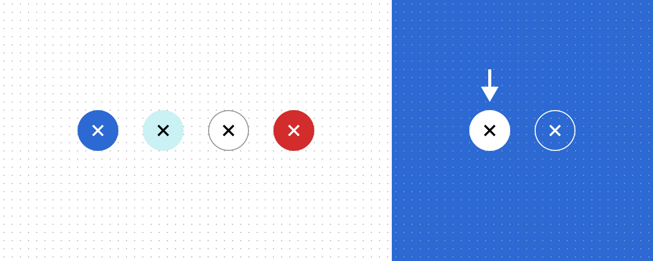 Fig. 6. All the style variants we’ve added so far.
We’ve found our variant style. Now, let’s read our usage guidelines for it. It says: “Emphasized action on inverse backgrounds. One per set of actions at most.” Hmm. Our use case (the modal window in Fig. 5) has a regular white background and we’re not trying to emphasize the button either—on the contrary, we’re going for a very minimal look there.
Should we still use it, maybe revise the guideline a bit as it seems like that’s the only thing in our way? Visually that variant seems like it’s exactly what we need, at least on the surface. But once we start considering the big picture, it becomes clear that we might actually need yet another variant. Here’s why:
-
The button has a white background, as does the modal window. But unless they use the exact same color token, there’s no guarantee that the colors are the same on e.g. dark mode. (We could fix this by using the same token.)
-
We use different focus state indicator for each variant: black ring for regular variants and a white ring for inverse variants. A white focus indicator would be invisible against our white modal window background.
In Fig. 7 we have added two new style variants for this use case: clear and inverse clear.
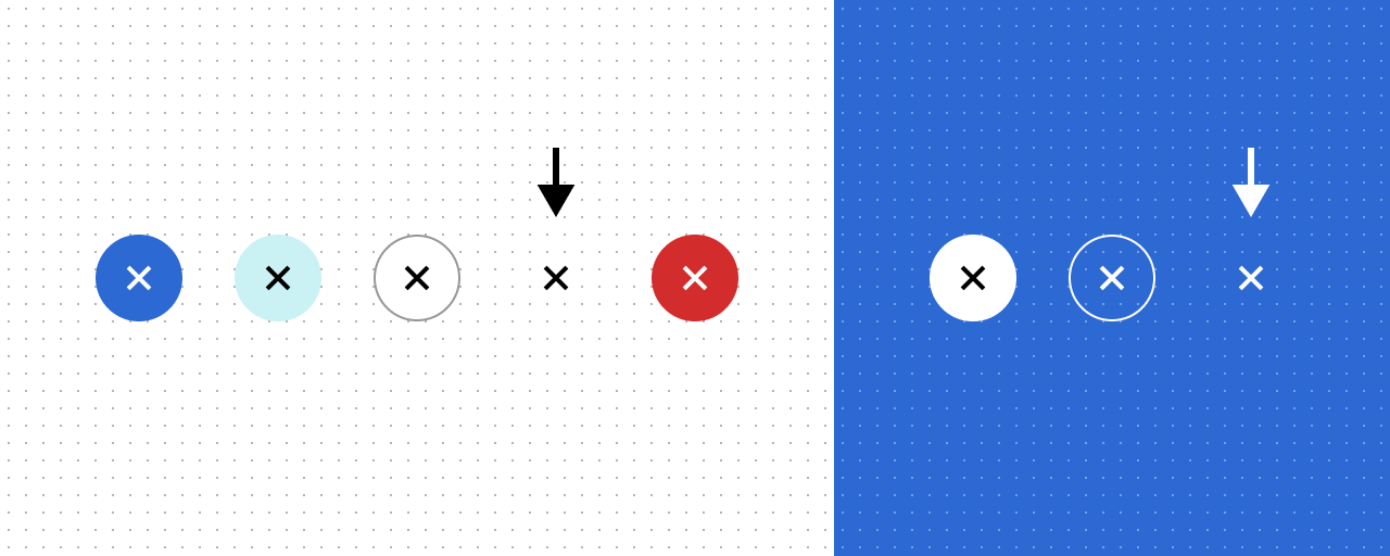 Fig. 7. All style variants. New additions are marked with an arrow.
The point where it all starts to fall apart
Coming up with solid usage guidelines for these variants can be difficult. Our immediate need only covered a single use case (the X icon in the corner of a modal window) and with a bit of foresight we‘ve addressed the same need on inverse backgrounds. But with both of these, we actually ended up with six new permutations: the one we actually need, two more in size variants and three with text buttons. (Fig. 8) These byproducts should be addressed somehow—we want to avoid any undocumented gray areas as they will likely lead to inconsistent UIs somewhere down the line.
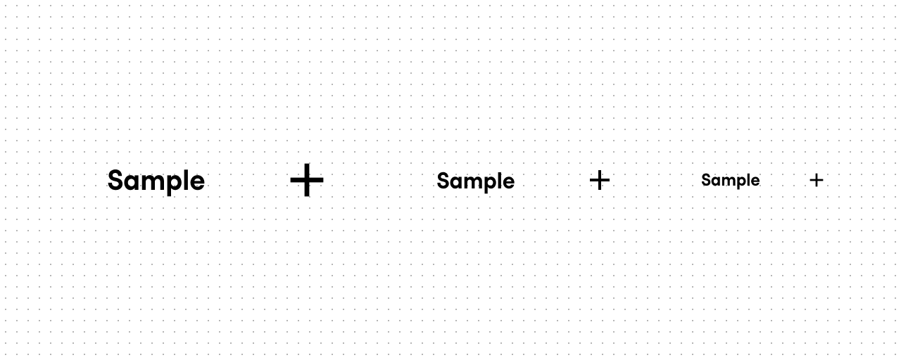
Fig. 8. Clear style variant in both text and icon forms, and in all three sizes.
We face a choice: do we try to figure out how this minimal variant is supposed to be used in all of its different forms so that we can provide solid usage guidelines, or do we leave out some variant combinations entirely. You see, we could get rid of the text button variants for this style only, leaving intentional “holes” in our selection of button variants. And while we’re at it, why not drop that large variant as well: it was designed for “call to action buttons in large marketing banners”, which is quite the opposite of our discreet clear button style. (Fig. 9)
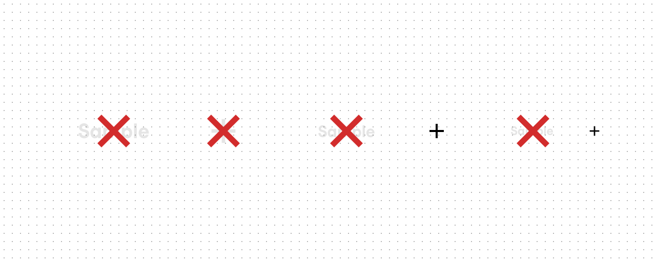 Fig. 9. Variant combination removals in four of our eight style variants.
If we take that road, we could also re-evaluate some other variant combinations. Do we actually need those large icon buttons in the other style variants of this new round icon button? Maybe, maybe not. But as an example, let’s say we don’t, and get rid of those as well. When we do, we might notice a new pattern emerging.
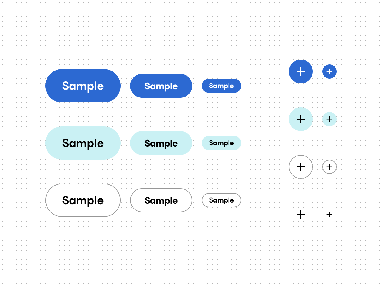
Fig. 10. Style and size variants after a bit of pruning: no large variants for icon buttons.
Look at the sets of button variants in Fig. 10. There are now enough differences between them that one could argue that these should be separated as two different components: a regular text button component and an icon button component. They have different sets of variants, the paddings are different, and on top that icon buttons have all kinds caveats and accessibility considerations that don’t apply to regular text buttons. (For example, how does a screen reader software or a person using their voice to control the UI refer to a button that doesn’t have a text label? Is our example a “plus” or an “add” icon? And the “fries” icon? A user could see a vacuum cleaner for all I know...)
But on then again they are both buttons: a button is a button is a button. Why should one component be separate from the other? What even is a component? These are the kind of questions where the answers usually only raise more questions. And these are not just philosophical questions as our decisions has very practical consequences in terms of a design documentation and technical implementation. And the needs of those different aspects might be in conflict with each other. I’m not going to argue whether our button component here should actually be two different components or not. I’m just pointing out that it’s something that must be decided. And now that I did, I think we are done here.
In conclusion
It’s not a coincidence that I chose a button component as the example in this series: in a way, it’s actually one of the more complicated components in a design system. It lends itself well for discussing the kinds of relatively low level details—and creating a button from scratch is a lot of work. Multiply that work by the amount of components and you can start to have some grasp the scale of work required to create a design system.
So, should you create a design system from scratch? You could borrow an existing design system instead. Or you could use an existing component library and build your design system around it. Or no design system at all? Maybe—sometimes you truly just need a button and nothing else.
One last time, here are some key takeaways:
-
Icons are a kind of content just like text. Using them along with text, either as a substitute or to enhance text, comes with a set of challenges to solve.
- Those little clickable icons you see in UIs are also buttons and they share most of their qualities with those more button-y buttons.
- There doesn’t seem to be a single way to interpret what exactly is a component. While the lines might blur and things get messy, this quote from the beginning of this blog series still holds true: “A central part of a design system is the library of reusable UI components—things like text fields, dropdown menus, and message boxes.”